During the beginning stages of designing my typeface I looked into other fonts which I liked and found aesthetically pleasing. Below are some typefaces which I found interesting and some which inspired my typeface.

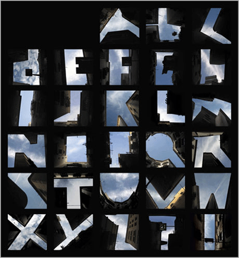
Letter forms made out of buildings. I found it interesting the negative space between the buildings force your eye to create the letter forms.
Alphabet designed in the style of paper folding.
I enjoyed this alphabet because it forces you to figure out what each letter is.
However even though I thought this alphabet was creative, it isn't easy to read and would lose alot of its detail and style in a smaller font size.

This is a graffiti style alphabet which I liked due freedom and flow in the letters. However like the others wouldnt work well as a text when putting words together.
This style of letting was very appealing to me as it caught my eye and had a fun feel to it. I found it creative how the letters force your eye to piece together what letter is being implied.
However like some of the previous these letters are strenuous on the eyes and are very difficult to read and would not work well in a body of words.

I was really attracted to this style of font as the letters all still flow well together even though they are all in different styles. i.e the different amounts of stress on each letter and the use of serifs and no serifs.
After looking at very creative and 'out of the norm' styles of type, I decided to look up more traditional font styles which I enjoy. One I am very fond of is Gothic style type.

I liked the fancy flow of the tails on the capital letters, however I think if it was used in a heading, it would look clustered and distracting.
The simplicity of these letters caught my eye with this typeface. I thought they worked well together and felt the serifs made the letters more visually pleasing.
I didn't like this style of gothic lettering as much as the others, especially the capitals. I thought the lower case letter however, where much more appealing and would work better together.


